STARBUCKS


Starbucks started an in-house advertising and design agency, "'71" which I was apart of. It ran the gamut from print ads to product design (ice cream cartons to CD packaging).


The carton redesigns had to both meet Starbucks AND Unilever standards for shelf recognition. In the end I thought - "white cup!" Everybody recognizes that.

This CD case design was for the HEAR Music Label.


These photo illustrations were used in pop-up stores nationwide.

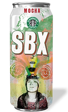

Some can ideas for an energy drink that came thiiiiiiis close.

VIA instant coffee needed some ads to convey what coffee drinkers currently endured.


UW MEDICINE
I art directed these print ads and TV spots as part of a campaign to get the University of Washington Medicine at the forefront of non-profit healthcare. The campaign ran from print to broadcast - including a logo redesign that would be a fixture on all hospital signage. The following year they made the top 10 non-profits in healthcare list put out by US News & World Report.

Being a non-profit meant low budget so stock photography was used for the entire campaign though we did end up shooting the TV spots. There's good stock if you know how to find it.


The log was used everywhere and on EVERYTHING.

TAZO
TAZO Tea wanted a series of print ads that rebranded them with emphasis on flavor. "Make it simple, bold and also simple," they said.

The concept had to fit within the already established TAZO brand design, which was extremely detailed (and awesome).


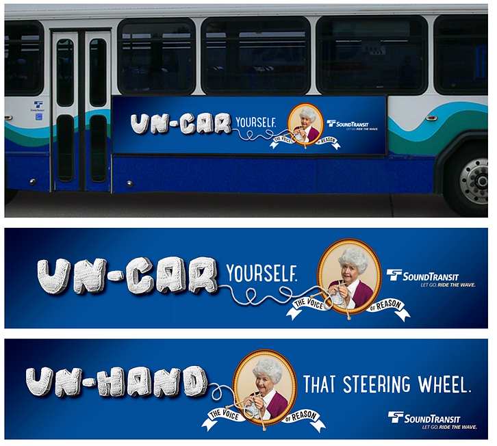
SOUND TRANSIT - SEATTLE
I art directed these transit ads for Seattle's only bus line. Originally the grandmother was cranky and Jewish, but that was later updated to Norwegian Northwest passive-aggressive.
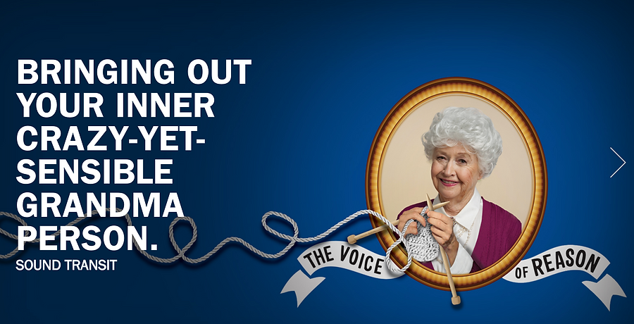
Original headlines had more of a guilt edge to them - "Take the bus so you'll have more time to call me."
THINK
THINK, a Seattle ad agency, wanted an entire rebrand with brochure, business cards - the works - stating their intentions. The readerboard was not photoshopped in.


This readerboard was driven all over Texas (where the photographer was based).
Had to build a livingroom when the readboard wouldn't fit in a house.

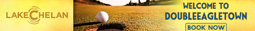
LAKE CHELAN
How many ways can you say "location" in the title? Turns out we thought of every single one.

Website and social posts for Lake Chelan tourism.


OUTBACK MOUNTAIN BOARDS

Outback Mountain Boards - it's a board with thick tires and shocks and you get on it and go down a a steep hill. Insane. A POP poster series announcing the brand.
I ended up shooting these with a large format camera in my backyard.


MICROSOFT VISTA
MICROSOFT VISTA
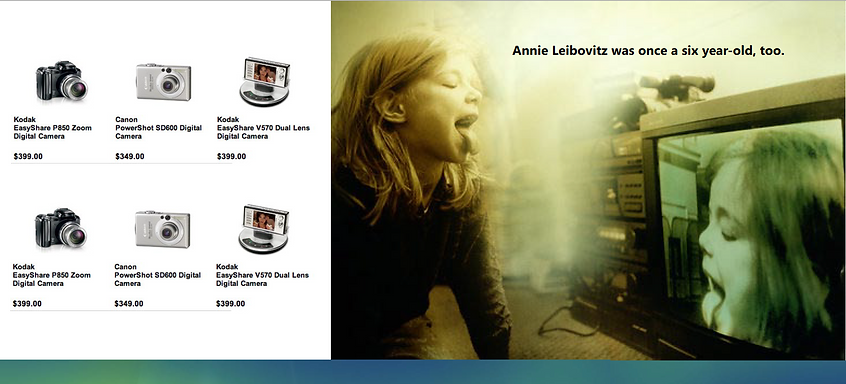
Annie Leibovitz was an easy sell, but Mary Ellen Mark they never heard of - so I showed them Diane Arbus and they said Mary Ellen Mark would be great.
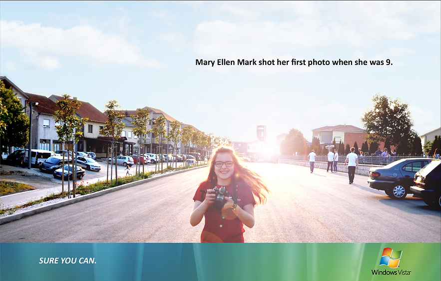
Brochure announcing the new operating system with emphasis on photography integration.